Building on Covve Scan’s core strength—fast, accurate scanning—while elevating the entire user experience.

Intro
Covve Scan is a networking app with over 1.2M users. My role was to deliver targeted product improvements that addressed usability pain points and strengthened the overall user experience. Throughout the process, we conducted almost weekly user interviews and reviewed customer support feedback to stay close to real user needs. By organizing and analyzing this feedback, we identified the most critical pain points and opportunities for improvement. Below are a few of the main projects I worked on.
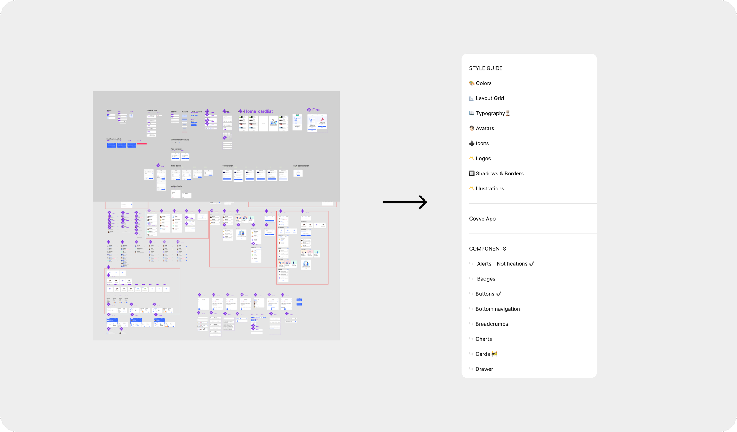
Branding & Visual Consistency
By modernizing the logo and introducing a design system, I transformed a fragmented interface into a unified visual language. Users now experience a cleaner, more professional app, while the development team benefits from faster and more consistent implementation.
Navigation & Usability
Users found the homepage and menu cluttered, with missing essentials like filters, sorting, and grouping. The three-dot dropdown caused confusion, icons felt inconsistent, and the floating action button only allowed scanning—leaving no option to add or share cards manually.
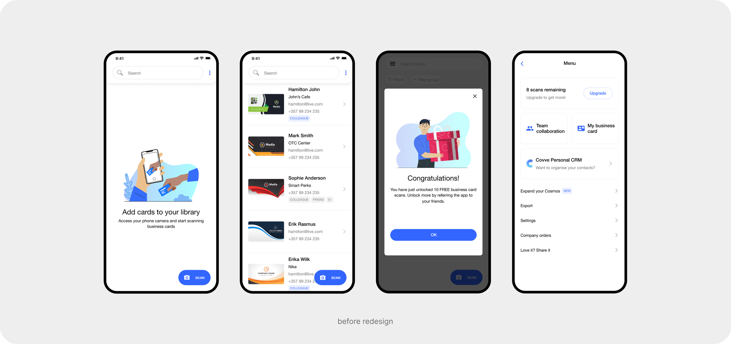
Key Enhancements
We addressed issues by introducing filtering and grouping tools, expanding the FAB actions, and restructuring the menu into clear sections. The result was a cleaner, more intuitive navigation that made it faster for users to find features and manage their contacts.
These improvements were introduced in phases, each addressing a specific usability challenge. The following screens highlight some of these focused enhancements.

Scanning & Card Details Experience
As the app’s signature feature, scanning had to feel fast, accurate, and effortless. I refined the scanning flow to remove friction points, resulting in a cleaner and more intuitive process that showcases Covve’s standout strength: exceptional speed and accuracy.
To complement this, I redesigned the detailed card view where users access their scanned contacts. The new layout improves readability and trust, making key information easier to scan at a glance and transforming the screen into a practical tool for daily use.

Menu Restructuring
I simplified the menu into four clear sections — Plan, My Business Card, Team Collaboration, and Settings. This reduced clutter and made it easier for users to find essential features.
For individuals, navigation became more straightforward, while business users gained quicker access to collaboration tools such as group creation, member tracking, and card management. The result was a more intuitive experience that supported both personal and professional use cases.

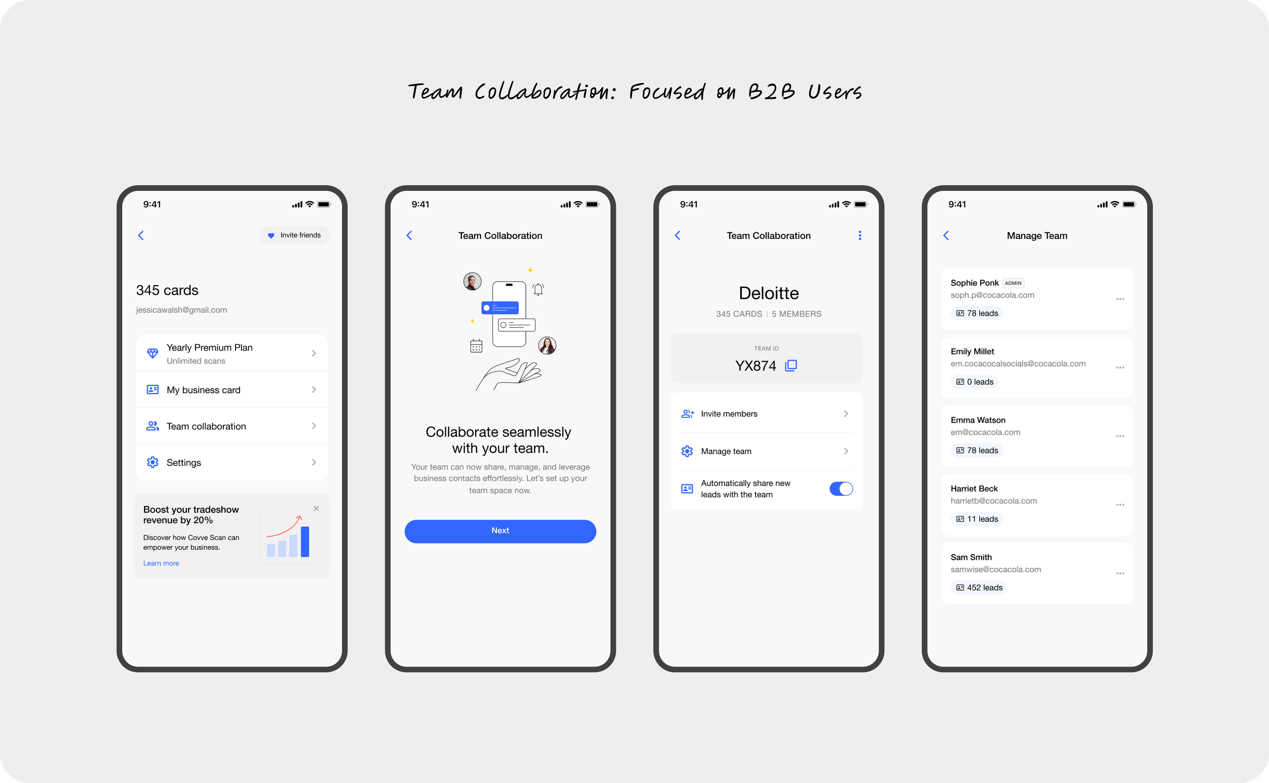
Team Collaboration (B2B Focus)
For business users, sharing and managing contacts as a team was critical, yet previously underdeveloped. I designed the Team Collaboration feature to support group creation, member management, and automatic lead sharing.
These updates made it effortless for teams to collaborate around contacts, boosting adoption among B2B users while keeping the experience simple for individuals. The result was stronger support for enterprise workflows and greater value for professional teams using Covve Scan.
Reflection
Each of these improvements built on Covve’s core strength: fast, accurate scanning. By refining the supporting flows — from navigation to collaboration — I helped create a smoother, more professional, and more scalable product experience. With over 1.2M users benefiting from these updates, the result was an app that not only stood out in its category but also earned greater trust from professionals worldwide.