Transforming Yodeck's onboarding experience with intuitive tours, guides and emails, making it easier for users and boosting adoption.

Overview
Yodeck is a digital signage platform that allows businesses to easily manage and display content on screens from anywhere. Like many platforms, onboarding plays a key role in helping new users understand how to get started and see the value quickly. However, Yodeck’s earlier onboarding process had some gaps that left users feeling confused. This case study looks at those challenges and their impact on the user experience.

Problem
Our analytics showed that 96.16% of users skipped the product tour. Once skipped, the tour was no longer accessible, leaving users without any guidance. This created confusion, increased support requests, and slowed down time-to-value. The lack of a clear, flexible onboarding experience meant that new users often struggled to navigate and understand the product on their own.
Research & Insights
To better understand the challenges, we used a mix of research methods, competitor analysis, and team workshops.
Survey Analysis
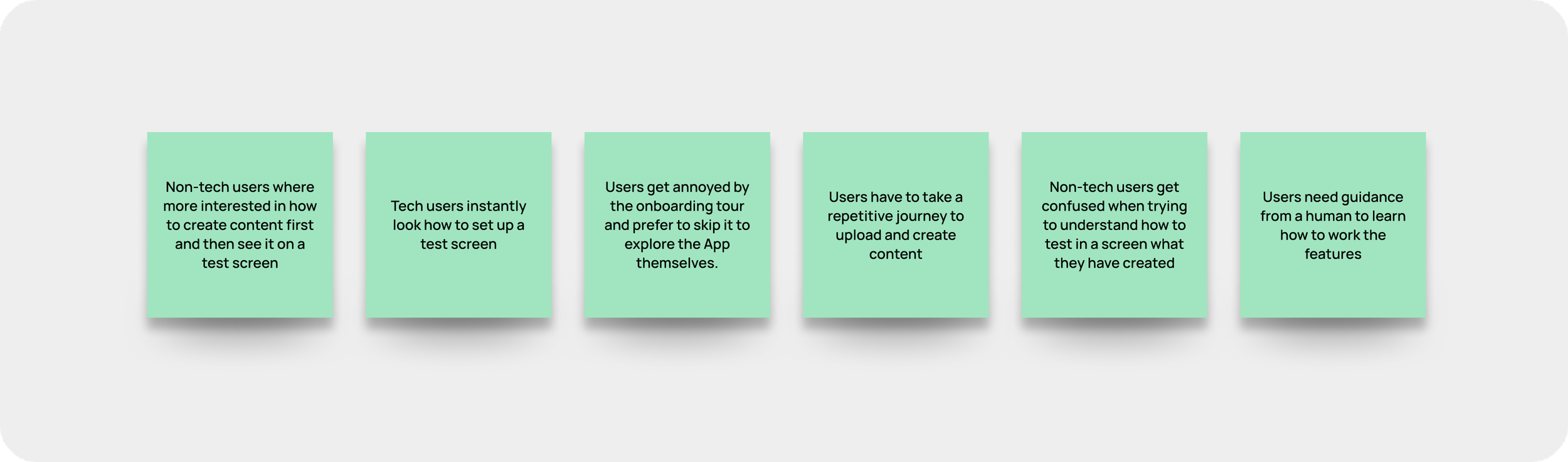
The UX researcher analyzed survey data from 97 users using the UMUX-Lite framework, which measures usefulness and ease of use. Scores ranged from 47 to 61 out of 100, showing that users found the onboarding difficult and not very helpful. This validated the need for significant improvements.User Interviews
To complement the quantitative findings, we conducted 11 in-depth user interviews.

Competitive Benchmarking
In parallel, I reviewed onboarding experiences in other digital signage and SaaS products. By analyzing their user flows, features, and overall UX, I identified best practices and innovative approaches that inspired our direction.
Brainstorming Workshops
The UX researcher and I facilitated collaborative sessions with the product owner, agile coach, and a developer. Mapping ideas on a whiteboard helped us uncover key themes and user needs, ensuring that our design work was guided by shared insights.

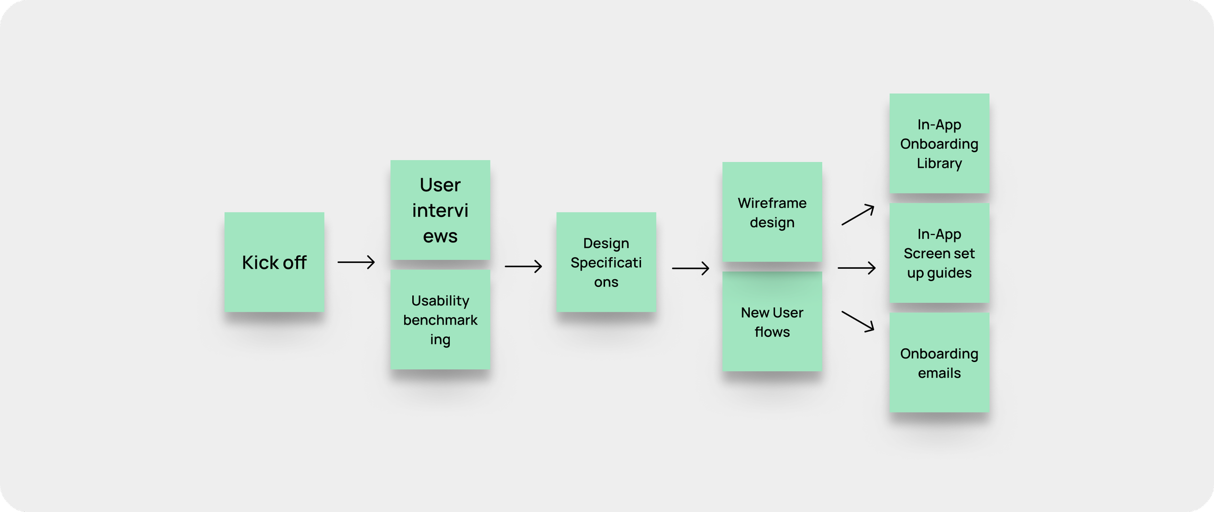
Design Process
Based on our research findings, we explored different approaches through low-fidelity wireframes. The goal was to make the onboarding more flexible, accessible, and easy to follow.
These early concepts allowed us to:
Test multiple ideas quickly before investing in high-fidelity designs.
Visualize how users could re-enter the onboarding flow at any time.
Experiment with layouts that balance clarity with freedom of navigation.
The wireframes served as a foundation for feedback from the team and stakeholders, helping us refine the direction before moving into detailed design.
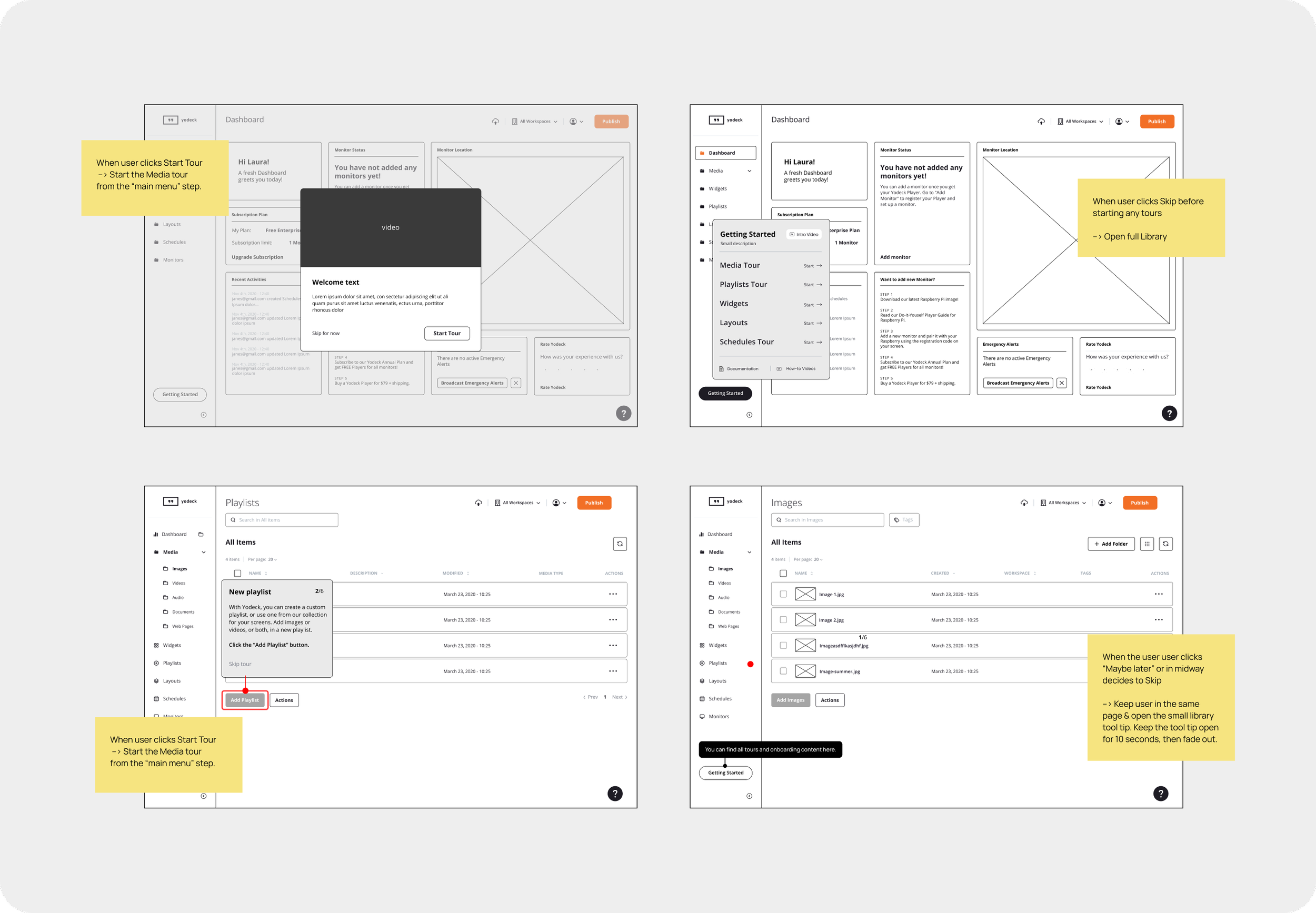
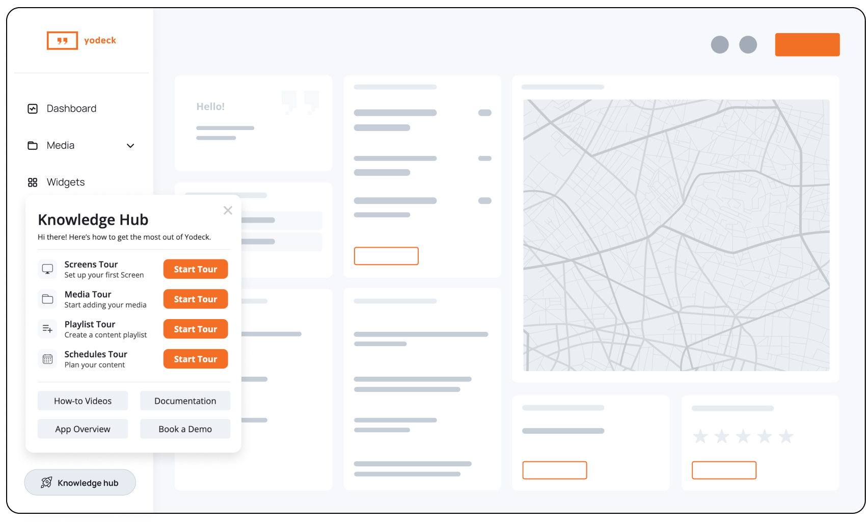
Iteration 1
The first iteration introduced a Knowledge Hub, a central place where users could access targeted tours, how-to videos, documentation, an app overview video, and even book a demo. This approach gave users the freedom to explore the platform at their own pace while keeping support resources always within reach.
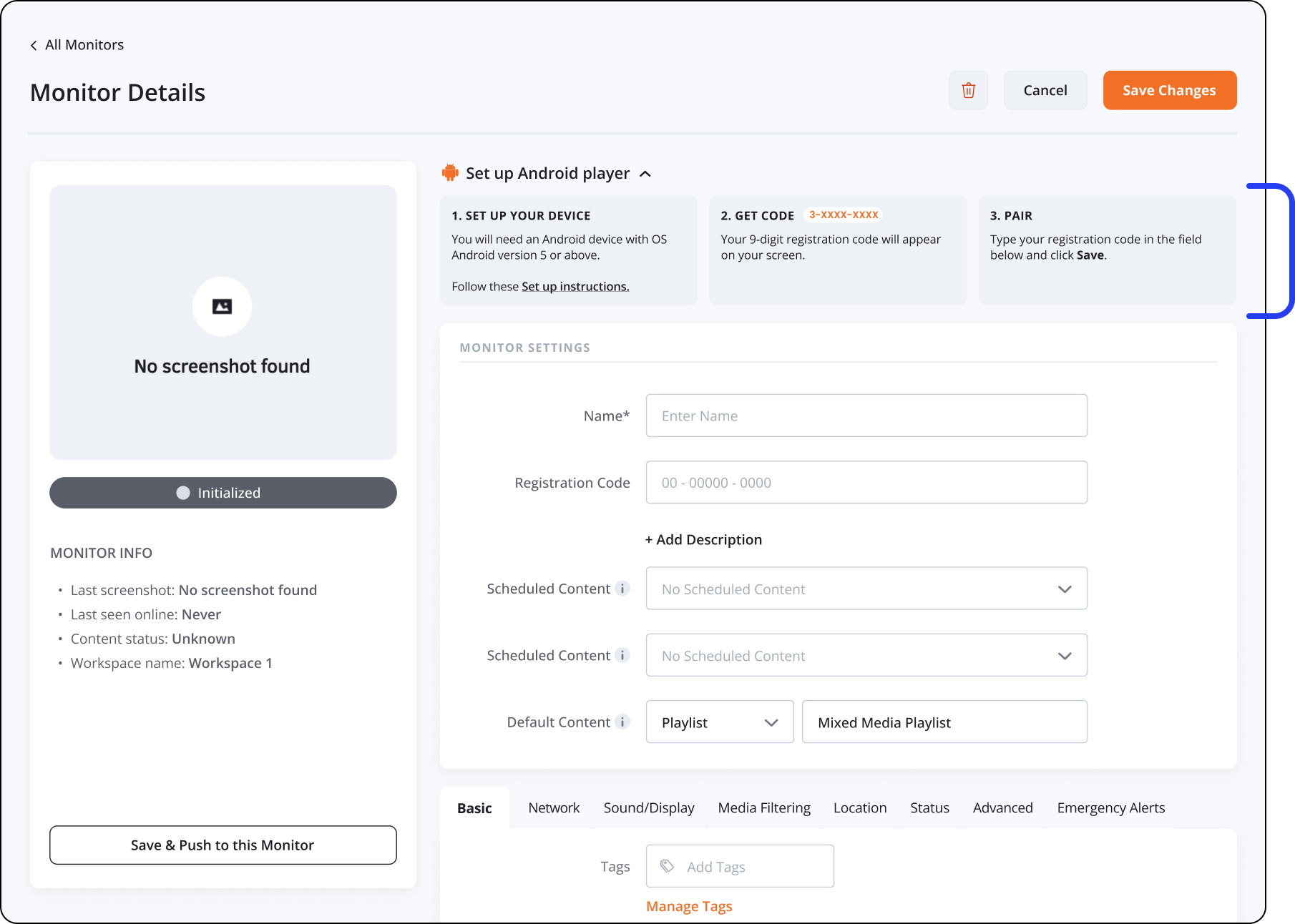
Iteration 2
We introduced Quick Setup Guides for test screens, providing step-by-step instructions to help users configure their displays with ease. Designed to be simple and user-friendly, these guides reduced confusion and enabled users to get started faster. The goal was to streamline onboarding by turning a complex setup into a clear, guided process.
Additional Solutions
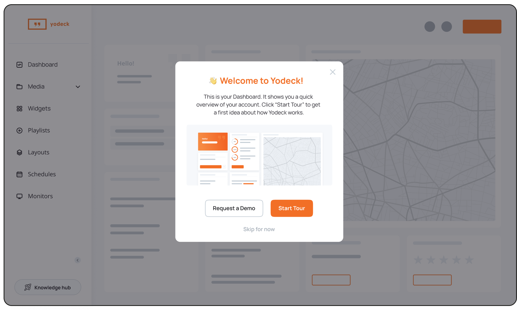
An additional solution was the creation of an introductory video to enhance the onboarding experience. I developed the initial concept and collaborated with an external freelancer for the animation, working closely with the marketing team to ensure it aligned with our branding and messaging. Together with the marketing and engineering teams, we launched a new email series to introduce key features and support user adoption.

Next Steps: Personalization
Looking ahead, our focus is on personalizing the onboarding experience. By tailoring guidance to individual user needs and preferences, we aim to deliver more relevant and effective onboarding. This will help each user achieve success with Yodeck more efficiently while strengthening long-term adoption.

Outcome
The redesigned onboarding experience streamlined the user journey, making it smoother and faster for new users to get started. This led to a shorter time-to-value, as users could quickly understand and engage with the platform’s features. We also reduced support tickets related to onboarding, optimizing internal resources and improving overall user satisfaction.